Hello and welcome to this Python and Pandas tutorial series, my name is Henry Mbugua and I will be taking you through the various aspects and new answers of how to pair Python and Excel which unlocks powerful tools that not only reduce your workload but also allow you to do more by helping your team or company get to the next level of data analysis. If you are ready to learn, continue reading.
Environment Setup
In this tutorial series, we will be using Anaconda Individual Edition which is the easiest way to perform Python data science. Visit Anaconda Individual Edition and download Anaconda based on your operating system. After downloading and installing anaconda on a machine, the next step is to set up our virtual environment, by running the following command:
conda create –name myenv
The above command will create a virtual environment called myenv, to activate this environment run the following command:
conda activate myenv
Learn more about how to create virtual environment using Conda. Now that we have already activated our python virtual environment, the next step is to install Pandas. The Pandas library is fast, powerful and easy to use open source data analysis and manipulation tool built on top of python.
conda install pandas
The above command will install pandas in our virtual environment. Once you have installed pandas successfully, we are going to learn a little bit about pandas. We need also to install openpyxl by running the following command:
pip install openpyxl
Understanding Pandas
Pandas is library that can consume data from a CSV, or a SQL database and creates objects with rows and columns called data frame that looks similar to the table in a statistical software e.g. excel. Pandas, will help you explore, clean and process your data. Learn more about data frames and pandas.
A Simple Practical Example of how to Use Openpyxl and Python
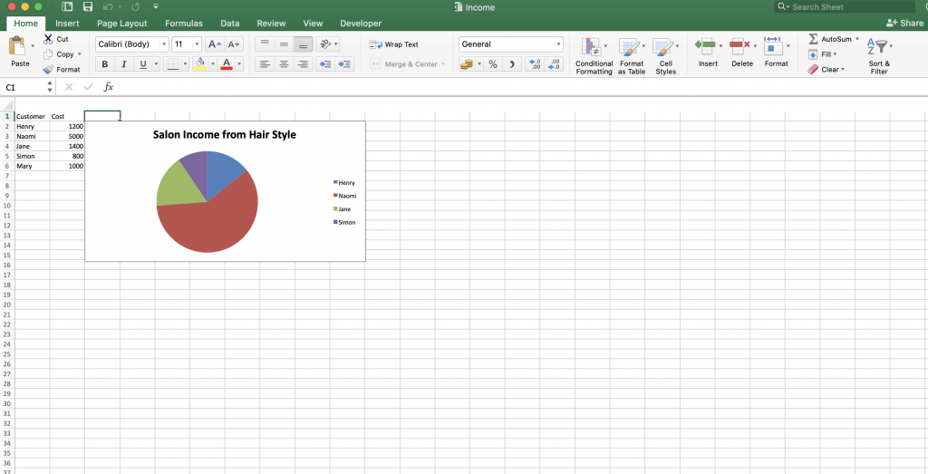
In this example, we are going to assume that we have a salon where we have generated income from different clients, often when you are working in excel it’s necessary to visualize your data through graphs or charts. Python has a module named Openpyxl which provides some great tools to automate this process of generating graphs or pie charts.
Now that we have a better understanding of Pandas, let us assume we have the following data.
| Client Name | Hair Style Cost (USD) |
| Henry | 1200 |
| Naomi | 5000 |
| Jane | 1400 |
| Simon | 800 |
| Mary | 1000 |
In the sample data above, we are going to generate an excel workbook and also visualize the data above in pie chart. Now, create a file called graphs.py file and make sure it has the following code:
import openpyxl
from openpyxl.chart import PieChart, Reference

wb = openpyxl.Workbook()

ws = wb.active

data = [
    ['Customer', 'Cost'],
    ['Henry', 1200],
    ['Naomi', 5000],
    ['Jane', 1400],
    ['Simon', 800],
    ['Mary', 1000],
]

for rows in data:
    ws.append(rows)


chart = PieChart()
labels = Reference(ws, min_col=1, min_row=2, max_row=5)
data = Reference(ws, min_col=2, min_row=1, max_row=5)
chart.add_data(data, titles_from_data=True)
chart.set_categories(labels)
chart.title = 'Salon Income from Hair Style'
ws.add_chart(chart, 'C2')
wb.save('Income.xlsx')
Now let us understand the code:
- Line 1 – we import openpyxl
- Line 2 – we import PieChart, Reference, from openpyxl.chart
- Line 4 – we create a variable called wb and set up our workbook.
- Line 6 – we create a variable called ws and set up our worksheet.
- Line 8 – we create a data variable called data, we make it a list and we have used simple data that is easy to visualize. In this case we have used a salon customer and the cost of making a hair style. Each list within the data list correspond to a column. First, we have our header row at line 9.
- From line 10 to 14 – we fill in the name of the customer and the amount they were charged at the salon for hair service offered.
- Line 17 – we have created a simple for loop to run through our data.
- Line 18 – we append our data into our worksheet. At this point, our workbook is created and filled with data. We can move on to create a pie chart from our data.
- Line 21 – we create a chart variable and now we need to inform excel how to use the data we have and map it to the chart. So, we have two types of data, the labels and the numerical data.
- Line 22 – we create a variable called labels and we use Reference to locate the data we want to store in our worksheet. We specify our worksheet, minimum column and minimum row this will take the data in between. In this case, our data goes to fifth row hence we pass maximum row to 5.
- Line 23 – we do the same as we did in line 22.
- Line 24 – we use our chart variable to add the data that we just reference in line 23 and set title to true.
- Line 25 – we use chart labels and set our categories by passing our labels define at line 22.
- Line 26 – we set the title of our chart.
- Line 27 – we add our chart to our worksheet and set it to start at C1 in excel.
- Line 28 – we save our workbook by the name called Income.xlsx
To test our code, open your terminal run the following command:
python graphs.py
In your working directory, you should see a new excel file called Income.xlsx and when you open it you should see the following:

Awesome, and that is how you can generate a Pie chart using an openpyxl library. Learn more about openpyxl and it’s usage.
Goal Achieved in This Lesson
In this lesson, we have achieved the following:
- We have learned about Anaconda Individual Edition.
- We have learned a little bit about pandas.
- We have learned how to do a practical example by using openpyxl and generating a Pie Chart.
In our next lesson, we are going to learn more about Pandas using practical examples.


Facebook Comments